Color Contrast On Your Website

Introduction
This information probably isn’t new to you, but it is worth reiterating. Color contrast (that is, the color of your background vs. the color of your text or image) matters a great deal on your website.
Why does contrast matter?
The easiest explanation is that if the contrast is poor, people can’t actually read what you’re writing. This is obviously a sales killer for your products. Poor contrast creates a lot of eye strain for people as they try to read through your text. The bigger issue, though, is that people who have a visual impairment might not be able to read it at all. This means that, not only are you neglecting an entire section of your market, you’re opening yourself up to accessibility lawsuits (which are currently on the rise).
How can I use my brand colors and still be accessible?
That’s a great question! I’ll provide an example using our brand colors which are gray, white, and orange.
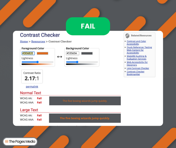
This first image shows two of our brand colors together - and you can hardly read it! When those colors are plugged into an accessibility tool, it fails on every level. What’s good from an accessibility standpoint really does benefit everyone, so avoiding these two colors together for text is a win-win.
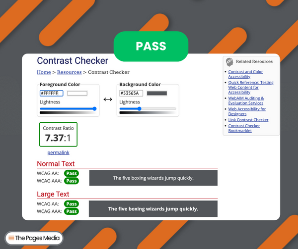
When I make a small change, while still using our brand colors, it meets all accessibility standards. It’s so much easier to read!
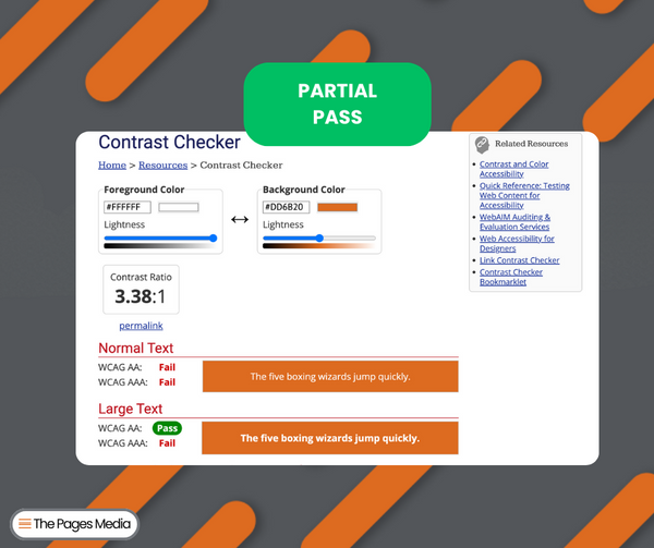
In this third image, you can see that when I make the font big and bold enough, the white text on the orange background also passes accessibility standards
Big and bold colors are fitting for a lot of brands, and this doesn’t mean you have to abandon them! It just means that you should be more mindful of how those colors are used together. Making small changes to color contrast on your website is one of the simplest ways to increase accessibility and create a better user experience for everyone!
Closing
If it improves accessibility, it helps all of your customers! The user experience (UX) plays a critical role in how people interact with your website, and this is a basic way to get started. Interested in a UX audit? You can contact us here to get started.
Resources
WebAIM Contrast Checker
How To Get Started With Accessibility on Shopify Blog Post


