Improving the User Journey

Introduction
Today, we're looking at some often overlooked user journeys on a supplement company’s website. Oftentimes UX experts focus a lot on visual aesthetics and clearly marking call to action buttons - and those things are important - but there are several parts of the user journey that could be causing friction that merchants might not even think about.
1. Navigation Clarity
Upon landing on the collections page, the layout initially appears straightforward. However, the positioning of filters proved slightly elusive because they're tucked away to the left corner on a page that presents a lot of content at one time. This means it's easy to miss.
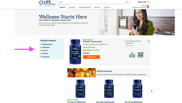
The page is promoting important categories, which is typically seen as good UX, but the layout here could potentially cause some usability issues. Because the supplements are already broken up into categories, it is even more important that the user is easily able to identify and utilize any sort of filter function that exists on the page.
2. Misleading Visual Cues
Consumers view many different websites so it’s important to understand they don’t always differentiate the type of site they’re on and they will bring their experience from other websites to your websites - there’s no way around that. This, then, should be a consideration for how pages are laid out.
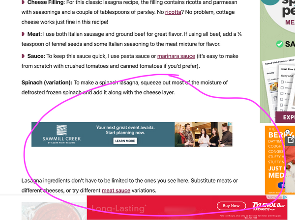
For example, it’s very common for recipe and blog sites to be loaded up with ads in between sections. When we look at the screenshot below, there are ads that run almost the same width as the text blocks.
We see the same structure utilized on Life Extension's website, except they’re not actually ads. They’re category headers.
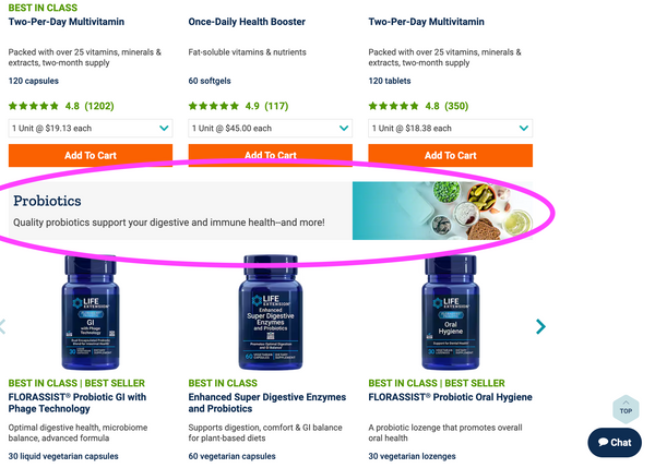
While these are meant to delineate different sections, they could be easily mistaken for intrusive advertisements. This is a reminder that visual cues must align with user expectations to prevent confusion.
3. Cart Cues
Add to Cart notifications should provide feedback that is clear and provides the user with information that they want to know. In this scenario, the question the user wants answered is “did this item get added to my cart?” On this site, a user will get the notification, but the popup bombards with extraneous information including cross-sells, promotions, and perks. In addition, there is no way for a user to actually see the item in their cart from this viewpoint
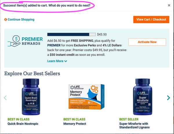
A streamlined approach, placing essential details at the forefront, could significantly enhance the checkout process for the user here and eliminate hesitancy.
Conclusion
There are many things to consider when establishing clear pathways for users, especially if the demographics of your shoppers vary widely. With that being said, identifiable navigation, immediate and clear feedback, and proper hierarchy will be necessary on every site regardless of what you sell or who your customers are. How that looks on your site should always be a data-driven decision.
Resources
UX Teardown - User Journeys
Baymard - 97 ‘Added To Cart Confirmation’ Design Examples
Baymard - Consider Promoting Important Filters


